Majella Coop
year
2026
client
Cooperativa Majella
designed with
Marialisa Giavitto
role
Brand Strategy, Visual Identity, Art Direction
scope
Brand Repositioning, Identity System, Sub-brand Development, Brand Applications

Majella Coop is a rebranding project for a territorial cooperative that connects people, schools and families with the landscapes, villages and cultural heritage of the Maiella region.
The new identity was designed to modernise the brand and create a more flexible system for its future growth, balancing its educational and family-oriented activities with the growing appeal of contemporary outdoor culture.
Developed collaboratively with Marialisa Giavitto through InGuardia Studio, combining brand strategy, visual identity and graphic design to build a flexible identity system for the cooperative.
Majella Coop is a rebranding project for a territorial cooperative that connects people, schools and families with the landscapes, villages and cultural heritage of the Maiella region.
The new identity was designed to modernise the brand and create a more flexible system for its future growth, balancing its educational and family-oriented activities with the growing appeal of contemporary outdoor culture.
Developed collaboratively with Marialisa Giavitto through InGuardia Studio, combining brand strategy, visual identity and graphic design to build a flexible identity system for the cooperative.


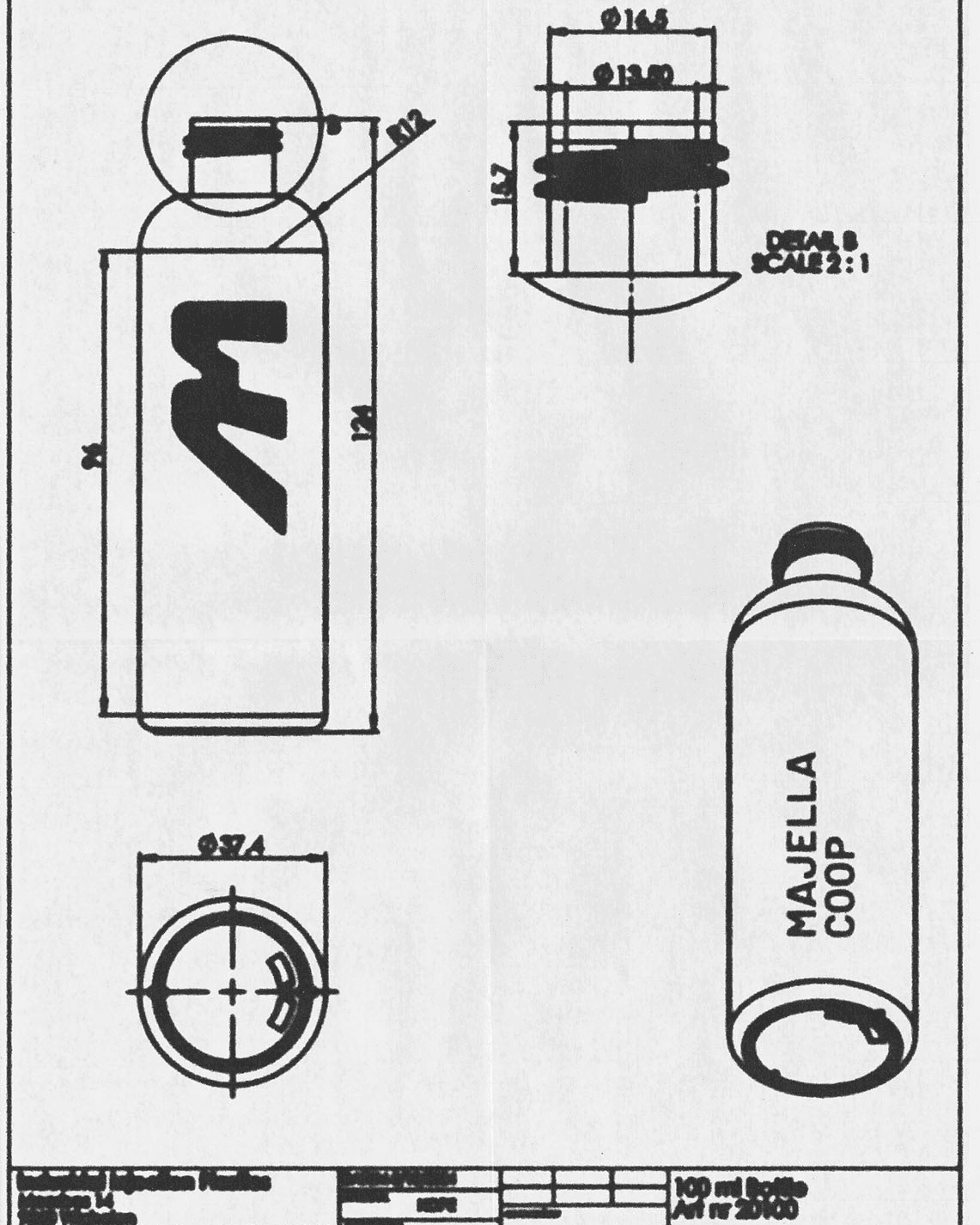
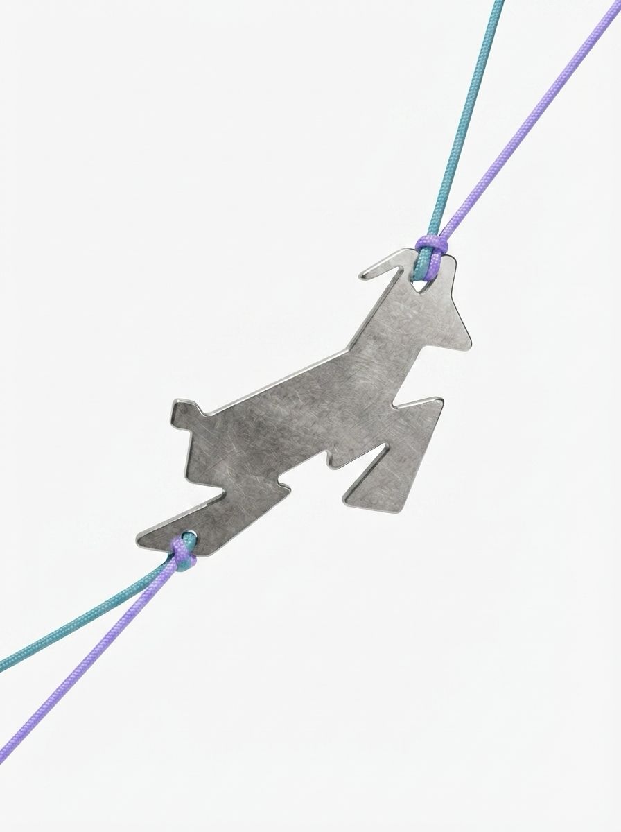
At the centre of the new identity is a reinterpretation of Majella Coop's historic chamois symbol, transformed into a dynamic and recognisable icon that feels both accessible and contemporary.
At the centre of the new identity is a reinterpretation of Majella Coop's historic chamois symbol, transformed into a dynamic and recognisable icon that feels both accessible and contemporary.


The visual system combines clean structures with more imperfect and tactile graphic elements, allowing the identity to adapt naturally across digital, print and physical applications such as stencils and screen printing.
The visual system combines clean structures with more imperfect and tactile graphic elements, allowing the identity to adapt naturally across digital, print and physical applications such as stencils and screen printing.


The project also establishes the foundations for a future sub-brand dedicated to more advanced and adrenaline-oriented mountaineering experiences.
While the main identity focuses on accessibility, discovery and education, the secondary system adopts a more technical and performance-driven character, maintaining a clear connection through shared graphic elements and typographic references.
The project also establishes the foundations for a future sub-brand dedicated to more advanced and adrenaline-oriented mountaineering experiences.
While the main identity focuses on accessibility, discovery and education, the secondary system adopts a more technical and performance-driven character, maintaining a clear connection through shared graphic elements and typographic references.
The identity was designed to grow across multiple touchpoints, from social media and digital platforms to printed materials, signage and spatial applications. The system also provides a flexible foundation for the future development of the outdoor-focused sub-brand.
The identity was designed to grow across multiple touchpoints, from social media and digital platforms to printed materials, signage and spatial applications. The system also provides a flexible foundation for the future development of the outdoor-focused sub-brand.

(CREDITS)
Studio — InGuardia Studio
(COLLABORATORS)
Marialisa Giavitto
(SERVICES)
Brand Strategy
Visual Identity
Art Direction
Brand Repositioning
Identity System
Sub-brand Development
Brand Applications
(LOCATION)
Lama dei Peligni (CH)